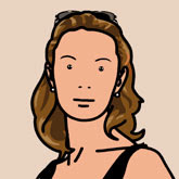
For the final task, we had to create a self portrait of ourselves using what we had learned in the lesson in the style of Julian Opie:
At the time, I did not use images to refer to when designing, which is also why I think my attempt went wrong. As I said before, the main reason my attempt did not work out was that I wasn't able to use the pen tool correctly so I had to use the paintbrush. Here is the attempt I made:
As you can see, It is obvious that I did not refer to any images as everything about it is wrong! The eyes are way too big and close together, the nose line is one big one instead of two little dots and the eye brows are too close together. It reminds me of one of those drawings the child who couldn't draw or paint would do, which is not good to say I'm doing a graphic design course! The only good thing about it is the lips, although they are done in the paintbrush they still have the shape that is used on the Julian Opie portraits.
So after this session, and a quick look on the internet on how to use the pen tool and found a good website that showed me how to use it which was useful when I made my second attempt. Here is my second attempt:
I feel like this attempt went a lot better than before, when doing the illustration I was constantly looking at how Julian Opie had done specific parts of the face and the thickness of lines he used. I also took into consideration my face shape by drawing my face when I was looking in the mirror.
Even though in the session I did not do very well, at least I came away and researched why I was going wrong then made a second attempt. It shows that even if I fail the first time i'm not going to give up and say that's it. I will try again.


No comments:
Post a Comment